

.png)
UX Case Study: an inventory-based pantry management app for mobile users
Cook Easy
Role: UX Design & Research
Teammates: Prachi Modi, Sree Teja, Supreeya Karn
Project Duration: January 2022 to May 2022
Developed for the graduate course in Information Architecture & Design
Cook Easy is a mobile application that aims to help users with their home cooking by providing them with simple and fast recipes and a way to manage their pantry.
The app suggests recipes that match the ingredients available in the user's pantry, taking into account their preferences and dietary restrictions. It also provides instructional videos and written guides to assist with the cooking process.


User Research >> Information Research >> Ideation >> Prototyping

01. User Research
As a project in Information Design & Architecture, it aimed to integrate user, content, and context. The team conducted user research, including identifying the target audience, creating research questions, conducting interviews, and analyzing data through personas, affinity mapping, and user journey maps.
1.1 Target Users
The app targets busy individuals, not limited by demographics. 11 participants, who were selected based on a screening criteria that they cook and manage their own kitchen, were interviewed about pain points and hurdles surrounding shopping, planning, cooking, and kitchen waste mitigation.
1.2 User Interviews & Takeaways
Research questions were formulated to guide interviews, which were converted to questions verbatims about cooking & shopping behavior, preferences, and pain points.
-
Living arrangement: understand cooking behavior and pantry management, who buys groceries
-
Meal plans: understand dietary requirements, prep time, and cooking expertise
-
Recipe learning: understand learning behavior, text/video preference
-
Shopping list: understand buying behavior, plan/buy ahead, run out of items, specific items for cooking
-
Kitchen management pain points: understand cognitive tasks that bother users during cooking and pantry management.
A sample of data points collected from the participants is shown below.
.png)
They were further grouped under common trends found in the data as shown below.
.png)
.png)
We discovered unexpected connections between pantry management, shopping behavior, and cooking patterns, expanding our perspective on the product's potential.
1.3 User Persona
Two user personas were formed to consider the requirements of the wide variety of user goals and needs identified from the user interviews of 11 participants.
Participant 1: Professional, lives with family
For 7 years, Sam has owned and managed an IT company, leaving him with little time for anything else. However, he still seeks healthy food options, preferably home-cooked meals. Balancing cooking, grocery shopping, and work has been a challenge, and he is in search of an app to simplify these tasks.
-
“I find recipe texts more convenient than videos when cooking. Videos are helpful for learning techniques and assessing visual cues such as the ideal level of browning.”
-
“I avoid recipes that are difficult or time-consuming”

Participant 2: Student, lives with a roommate
Alice, a graduate student, has a fixed monthly budget for groceries and needs recipe ideas using items in her pantry. As she didn't cook regularly before, she also requires assistance with basic cooking skills. Additionally, she wants to make sure to use all pantry ingredients before going grocery shopping.
-
“Pausing and playing a video is difficult while cooking, especially when your hands are soiled or wet.”
-
“I shop for rice [carb], some proteins and veggies” .........” typically cook with what I find in the fridge or cabinet” [organization].

02. Information Research
The next step was to conduct information research by studying user goals and needs, analyzing key competitors' product offerings and contents through competitive analysis and content inventory. This helped identify information objects, controlled vocabulary, and key relationships, which were used to develop a concept model.
2.1 Competitive Analysis
The apps provide information on pantry management, recipe management, and recipe recommendations based on available inventory, with shortcomings. The apps were analyzed in 3 significant areas:
-
Information Architecture
-
App content
-
Visual design
3
Direct
Competitors
39
Assessment
Criteria
3
Indirect
Competitors


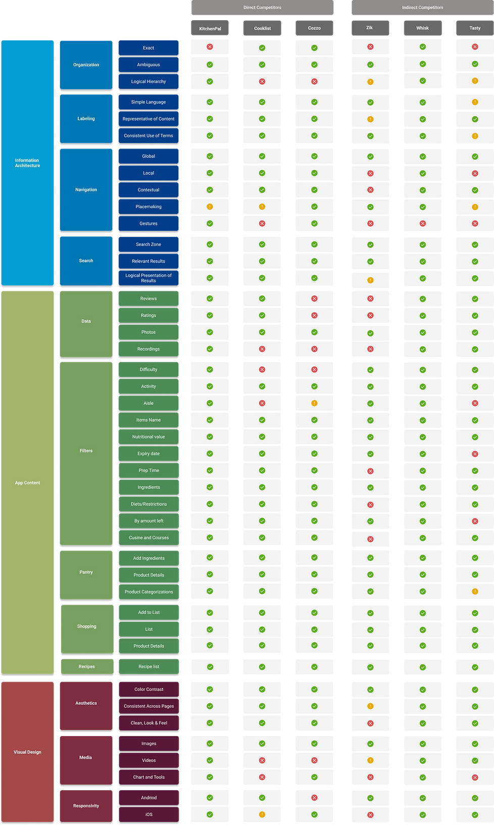
Competitive Audit
2.2 Concept Model
Through competitive analysis, we identified the three main components of the ecosystem. We then established the relationships between them and defined their content.
As the product is a smartphone application, we had to find alternate methods to define the interrelationships between different sections, similar to a sitemap on a website. We determined that a concept model was the most suitable approach to define these interrelationships.

Recipe
This section features ‘recipes’ that are tagged based on cuisine, diet type, ingredients, quantities, difficulty level, time to cook, etc

This section features ‘products’ that are tagged based on categories that helps identify with recipe ingredients
Pantry


Shopping
This section features ‘products’, similar to the pantry section. However, the organization i based on aisles and will feature more options
We iterated through a whiteboard exercise to understand how sections of the application can connect and maximize user satisfaction.
The concept model serves as a diagrammatic representation of interrelations between content types and processes in the kitchen ecosystem.
After defining the interrelationships between the components and sub-components, we finalized the concept model, which was then transformed into a wireframe during the design phase.
.png)
2.3 Content Inventory
Creating a content inventory allowed us to establish the project's scope by listing every feature and offering that would be present in the product. This inventory includes all information and meta elements, along with a categorized list of contents in the recipe, pantry, shopping, and user profile sections of the application.
Pantry Inventory
Metadata: Name, quantity, dates, nutritional info, brand, barcode, etc
Shopping cart
Metadata: Name, quantity, dates, nutritional info, brand, barcode, etc
Recipe list
Metadata: Name, ingredients, cuisine, time to cook, difficulty level, etc

2.4 Information Objects & Controlled Vocabulary
Through competitive analysis and content inventory, we gained a better understanding of the information objects, metadata, and controlled vocabulary required for our ecosystem. We identified user tasks and their interrelationships between atomic objects such as pantry items and recipe objects.
We also recognized the importance of a controlled vocabulary to link diverse pantry objects to recipes. For instance, a pantry item like 'Vitamin D Whole Milk- 1 gal- Good & Gather' may not be recognized as '1 cup milk' required for a recipe like raspberry swirl ice cream. Thus, a uniform vocabulary that identifies both objects as 'milk' is necessary to bridge this gap. The importance of controlled vocabulary is illustrated in the figure below.


03. Ideation & Design
After gaining a comprehensive understanding of the user, content, and context, the next step was to ideate and design the user experience. To achieve this, we went back to our research to develop additional artifacts.
3.1 Affinity Mapping
We further clustered the data points from user interviews at a higher level based on the three major sections we identified during information research. From this exercise, we identified the importance of a fourth section to users; learning, which we integrated into the design.

3.2 User Journey Map
We developed user journey maps for two personas after analyzing our direct competitors. This gave us a user perspective and helped us identify limitations in existing apps that turned into opportunities for our design project.
.png)
.png)
3.3 Sketching
At this stage we took to hands-on designing, beginning with sketching initial layouts for the critical screens as shown below. These sketches were later converted to paper wireframes and further to digital wireframes.


3.4 Wireframing
Next, we transformed our sketches into digital wireframes. These wireframes may have been low-fidelity, but they included all the essential components to carry out the most important user tasks. It was a significant step forward in the design process.
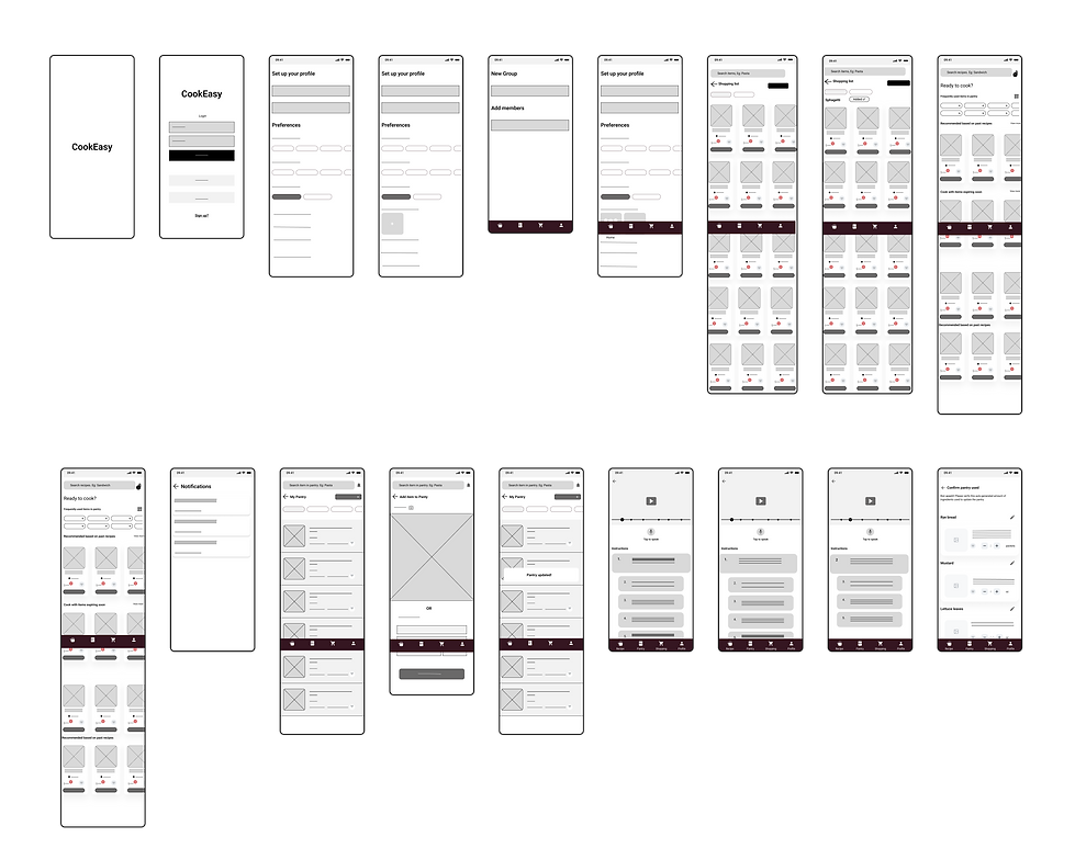.png)
04. Prototyping
We knew our product was complex and had a variety of tasks, so we wanted to make sure we were on the right track. We made low-fidelity prototypes using our digital wireframes and conducted usability tests with 8 people. Based on their feedback, we made changes and created a mid-fidelity prototype. After more testing and feedback, we worked on a high-fidelity prototype.
4.1 Low-fidelity Prototyping
We identified 8 key user tasks to guide our design of the prototype.

4.2 Pilot Test & Cognitive Walkthrough
During our cognitive walkthrough of the low-fidelity prototypes, we focused on testing how well users could perform the 8 key tasks we had designed. We chose this stage for testing as it allows for easier modifications. Based on the results, we gained valuable insights, including:
-
The onboarding screens should be split up to reduce cognitive load.
-
The ingredients list should use a controlled vocabulary to help users identify items.
-
Font sizes should be increased for better readability.
-
The units of measurement for pantry items should use user-friendly language, like slices or tablespoons instead of lbs/oz.
-
Voice instructions should be added before tapping to avoid ambiguity.
-
Descriptions should be added to improve understanding, like adding ingredients to filter recipes.
-
Highlights should be added to the icon representing the current tab to improve navigation.
-
More icons should be added on the recipe and shopping page for a better understanding.
-
The tutorial page should highlight the current instruction to improve focus.
4.3 Mid-fidelity Prototyping
In the next iteration, we solved the 9 key issues identified from the cognitive walkthrough and added more screens, features, and elements to improve the usability of the app.
We modified user flows to match users' mental model and added features that users were expecting.

4.4 High-fidelity Mockups
Users found our mid-fidelity screens too text-heavy, so we decided to create high-fidelity prototypes emphasizing visual design and animations/micro-interactions. After conducting a pilot test, we saw significant improvements in time-on-task.

4.5 Clickable Prototype

This is a clickable prototype.
You can do the following tasks:
-
set up and customize the app ecosystem,
-
add roommates or family members,
-
filter and choose recipes based on preferred ingredients,
-
add missing ingredients to the shopping list,
-
add items to the pantry using image recognition or manual entry,
-
use real-time video and text-based cooking guidance,
-
activate optional voice controls, and
-
verify the amount of each pantry item used.
4.6 Future Scope
Here are some potential ideas we came up with for future improvements to the app:
-
We thought about adding a subscription feature that would automatically update your pantry and shopping list based on your preferred recipes for the week.
-
Another idea we had was to give users more options for online grocery stores and include a tool for comparing store prices of similar products.
-
To address the affordability concerns of many users, we considered adding a feature for tracking grocery expenses and budgeting.
-
Lastly, we thought it would be great to integrate a way to donate expiring groceries to those in need through voluntary organizations.
05. Learnings
Through this course and project I learned:
-
a new design approach where we begin by understanding the nature of the content and its interrelationships.
-
how controlled vocabulary plays an integral part in forming relations b/w diverse areas of an app ecosystem
-
how information objects play a crucial role in determining the sequence and hierarchy of flow and the overall scope of the project. (Object-oriented design)
-
how conscious emphasis on organization, navigation, labeling & search can improve the overall user experience.